pegkerr: (Default)
pegkerr ([personal profile] pegkerr) wrote2020-01-08 06:55 am

Emerald House Rising cover proposal(s)

What do you think? I'm still trying to figure out what I think of them. Adjusting a bit because it doesn't exactly resemble the world I created in my mind.

Which font do you like better?
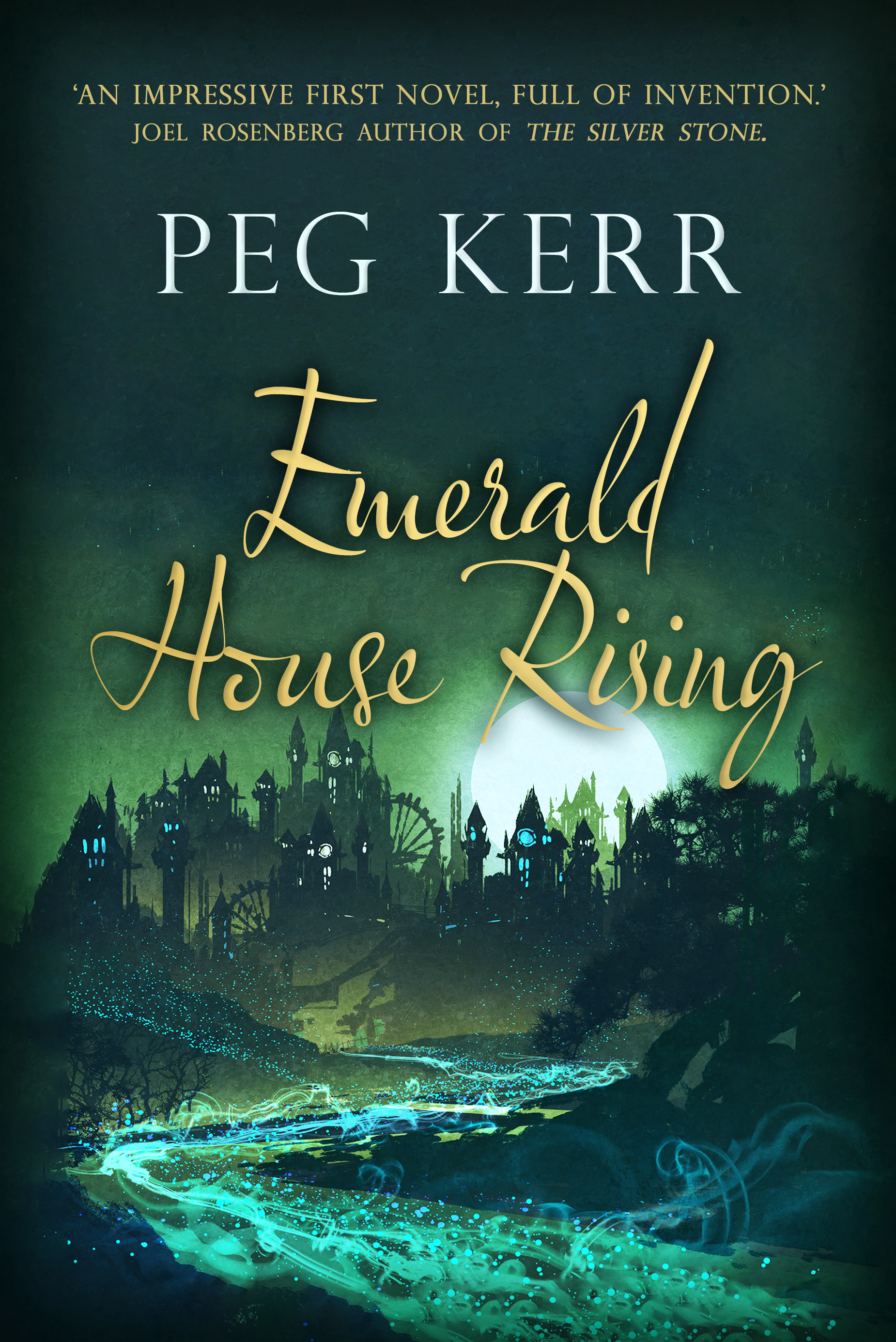
A moon rises over a city at night, with a spangled river running beneath.


A moon rises over a city at night, with a spangled river running beneath.
redbird: closeup of me drinking tea, in a friend's kitchen (Default)

[personal profile] redbird 2020-01-08 01:16 pm (UTC)(link)
The second font, which I find more legible
kiwiria: (Default)

[personal profile] kiwiria 2020-01-08 01:40 pm (UTC)(link)
Like you, I had to adjust a bit, because it doesn't resemble the world I'd pictured either. Almost seems steampunk'y somehow? But that might just be the wheels giving me that impression.

But that aside, I really like them! It's definitely a cover that would make me pick up the book and check out the back blurb. I by far prefer the second font though.
magenta: (Default)

[personal profile] magenta 2020-01-08 02:45 pm (UTC)(link)
I like the second one better. So glad this is coming out again.
lsanderson: (Default)

Bestest of Two?

[personal profile] lsanderson 2020-01-08 03:14 pm (UTC)(link)
The second font is more legible, but neither scream 'buy me' to me.
pameladean: (Default)

Re: Bestest of Two?

[personal profile] pameladean 2020-01-08 07:51 pm (UTC)(link)
I really like the composition of the cover, and the river is very cool. Neither font exactly does it for me, but I'm weird about covers in most ways.

P.
lsanderson: (Default)

Re: Bestest of Two?

[personal profile] lsanderson 2020-01-08 11:43 pm (UTC)(link)
It's the book title fonts I don't like. The first, which is almost illegible, and the second is only slightly better, less puzzling script. But, why script? Kids these days don't do script, or so I've heard.
carbonel: Beth wearing hat (Default)

[personal profile] carbonel 2020-01-08 08:46 pm (UTC)(link)
I'm not a fan of script fonts for text that should be read-from-across-the-room legible, and both of those have the same problem.

The artwork is pretty, but doesn't match my memory of the book. But I think there's a good chance it will sell books, which is the important thing.

Since you have to pick your fights, I'd suggest pushing for a more legible title.
malinaldarose: (Default)

[personal profile] malinaldarose 2020-01-08 10:31 pm (UTC)(link)
I think the second one is easier to read.
aome: (Default)

[personal profile] aome 2020-01-09 12:29 pm (UTC)(link)
The second one. Do you get any say over the cover image, especially given that you now know it's been used for other things? It seems like if it doesn't match your image of your own creation, you should be able to say something.