pegkerr: (Default)
pegkerr ([personal profile] pegkerr) wrote2020-01-08 06:55 am

Emerald House Rising cover proposal(s)

What do you think? I'm still trying to figure out what I think of them. Adjusting a bit because it doesn't exactly resemble the world I created in my mind.

Which font do you like better?
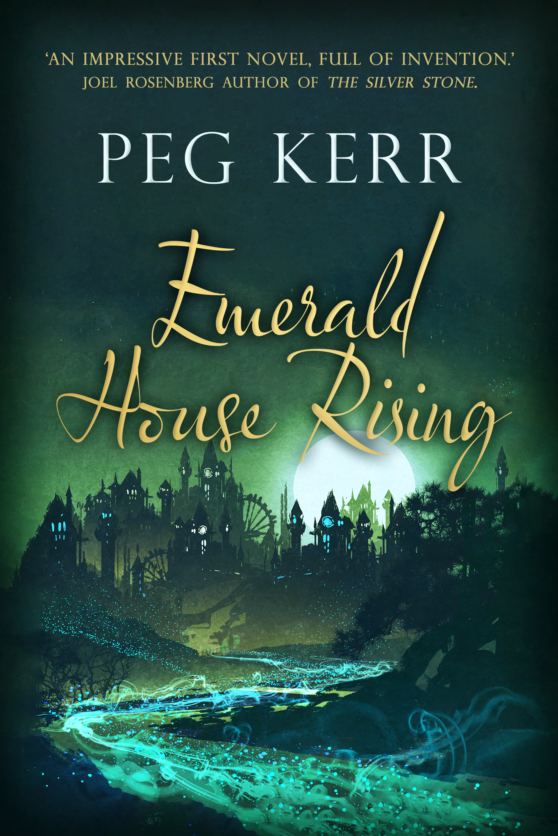
A moon rises over a city at night, with a spangled river running beneath.


A moon rises over a city at night, with a spangled river running beneath.
lsanderson: (Default)

Bestest of Two?

[personal profile] lsanderson 2020-01-08 03:14 pm (UTC)(link)
The second font is more legible, but neither scream 'buy me' to me.
pameladean: (Default)

Re: Bestest of Two?

[personal profile] pameladean 2020-01-08 07:51 pm (UTC)(link)
I really like the composition of the cover, and the river is very cool. Neither font exactly does it for me, but I'm weird about covers in most ways.

P.
lsanderson: (Default)

Re: Bestest of Two?

[personal profile] lsanderson 2020-01-08 11:43 pm (UTC)(link)
It's the book title fonts I don't like. The first, which is almost illegible, and the second is only slightly better, less puzzling script. But, why script? Kids these days don't do script, or so I've heard.